
My Two Cents - "Leading to What?"
08/21/2009
Last weeks essay centered on the fact that America has borrowed nearly $12 trillion dollars yet achieved very little, if any real economic growth in the last half century. If that wasnt alarming enough, this weeks effort should suffice to turn some heads. While last week we used the broadest monetary aggregate M3 to discount GDP, this week were going to take a look at velocity of circulation in the M2 aggregate and translate that into some logical conclusions. Politicians, the Conference Board and nearly every alphabet soup media outlet known to man are trying to talk this economy out of recession. We already know that talk is cheap, but I have a distinct suspicion that were soon going to find out exactly how cheap it really is.
But why pick on M2? The reason here is simple. The Conference Boards index of leading economic indicators (LEI) assigns M2 a whopping weight of 35.8%. So just creating money automatically means good things will happen? Here we get yet another insight into one of the many flaws of Keynesian economic theory. Average weekly hours in manufacturing is the second largest component of the index or LEI and is assigned a 25.49% weight. It should be immediately obviously that significant changes in M2 could easily overshadow diverging movements by other components of the Index. The full chart is displayed below, from the Conference Boards website:

Thursday morning, the Conference Board reported that its LEI rose by .6% for the month of July and has in fact been rising for the past 6 months. Interestingly enough, M2 was cited as applying negative pressure in Julys number. However, even this number is not immune to hedonics. The Conference Board adjusts M2 by the Personal Consumption Index deflator which is based on guess what? The CPI. So by using a negative deflator, the Conference Board is alleging an increase in real M2, which has been helpful to the LEI over the past few months. However, money supply doesnt equal economic activity and well show you why.
Before we get too far into this analysis, lets present some baseline definitions of M1 and M2:
M1 Aggregate: M1 includes funds that are readily accessible for spending. M1 consists of: (1) currency outside the U.S. Treasury, Federal Reserve Banks, and the vaults of depository institutions; (2) traveler's checks of nonbank issuers; (3) demand deposits; and (4) other checkable deposits (OCDs), which consist primarily of negotiable order of withdrawal (NOW) accounts at depository institutions and credit union share draft accounts.
M2 Aggregate: Equals M1 + savings deposits, time deposits less than $100,000 and money market deposit accounts for individuals.
Many economists view M2 as a good measure of near term inflationary pressures. M3 is generally regarded as a longer-term inflationary indicator, which is why it was used in last weeks 50-year analysis.
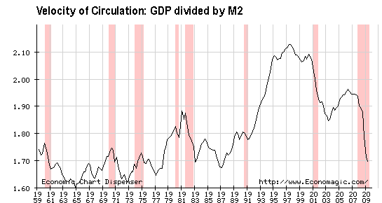
What also needs to be looked at is the velocity of circulation of the aggregates. This is the turnover rate or the number of times each dollar within the aggregate changes hands in a given period of time, generally a year. Obviously, velocity of circulation or turnover is an indicator of the level of economic activity. The higher the velocity, the more times in a given year a particular dollar changes hands. And vice versa. The velocity of circulation is arrived at by taking GDP and dividing it by the appropriate aggregate.
In the chart below, we see the velocity of circulation for M2. It is interesting to note that M2 velocity peaked in 1997, then fell into a 2003 trough, rose again slightly, most likely in response to ridiculously low interest rates, then plummeted from 2006 through the present. Obviously, we would expect to see velocity decrease during a recession since there is diminished activity. The current plunge in velocity has happened despite over $1.3 trillion of deficit spending just in the last 10 months. A few weeks ago we made the case that deficit government spending should be discarded from or at least discounted in GDP. Following that logic and recalculating M2 velocity based on the lower GDP reading, we would currently have a M2 velocity of 1.54 vs. the 1.70 displayed in the chart; a decrease of 9.41%. In essence, the $1.3 trillion in deficit spending is causing a near 10% overstatement of activity as represented by M2 velocity.
The admission is readily made that perhaps not all deficit spending would find its way into M2; some might certainly end up in components which are exclusive to M3, and so the adjustment is meant to be illustrative in nature and indicative of the distortions that government spending is causing in metrics that were previously more closely related to the real economy.
Perhaps even more interesting is the obvious sluggishness in the response of M2 Velocity to interest rate stimulus in the form of the Fed Funds Rate.
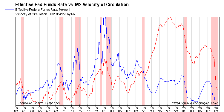
Taking a look at the two preceding interest rate lowering campaigns, the Fed Funds Rate (FFR) peaked in 1989, then bottomed in 1993. Velocity responded fairly quickly, beginning a steady climb up towards the end of 1991 or about halfway through the rate-cutting cycle. The FFR peaked again in 2000 and the next rate-cutting campaign lasted until late 2004. Again, velocity responded rather quickly, bottoming, then beginning to climb in early 2003. The response to that stimulus, however, was much less than the prior, even though the magnitude of the stimulus was similar. The FFR peaked again in late 2006 and the next rate-cutting campaign began in earnest and has stopped only because rates have essentially hit zero. So this rate-cutting campaign has lasted nearly 3 years, and there has been absolutely no response in M2 velocity to speak of.
If this isnt an indication that monetary policy has lost the majority of its effectiveness, then I dont know what is. Perhaps the Conference Board could take into consideration that it is easy to inflate, but it is considerably harder to generate even cursory activity, let alone real economic growth simply by printing more money.
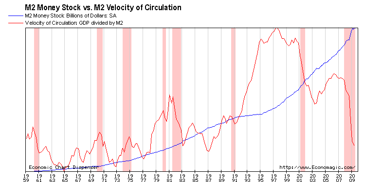
As is evidenced above, M2 Velocity is certainly not directly proportional to M2 growth. The determinant in velocity of circulation is GDP. Take for instance the period between 1991 and about 1996. M2 growth was relatively flat, yet velocity increased dramatically. This tells us that GDP increased despite the lack of increase in M2.
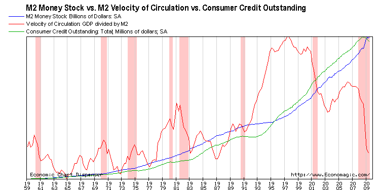
However, had one stopped there and not looked at consumer credit, (largely unaccounted for in the monetary aggregates) which went ballistic in 1993, the above chart would have led them to believe that there was genuine economic activity during that period. The only reason I chose to even mention this is to point out how the law of diminishing returns has played out again. Consumer credit, which was able to stimulate a significant increase in M2 velocity (activity) in the 1990s, was not able to do so in the early part of this decade even though it increased steadily until the latter part of 2008.
As many readers have already noticed, recent essays have focused on picking apart the major economic reports and pointing out distortions and possible distortions where they exist. The reason is simple. Many self-directed investors, consumers, and even advisers make important financial decisions based on the fact that some number went up when it was supposed to go down or vice versa. It would make sense that those same people would want to know where that number came from, how it was derived, and what the risks to the presented analysis are before making those important decisions.
We have bundled together the series Basic Financial Analysis in PDF format for anyone who would like a copy. Also included in the PDF is an unpublished section on portfolio monitoring. To obtain a copy, please visit: http://www.sutton-associates.net and click the report banner.
Until Next Time,
Graham Mehl is a pseudonym. He is not an âinsiderâ. He is required to use a pseudonym by the policies of his firm when releasing written work for public consumption. Although not an insider, he is astonishingly bright, having received an MBA with highest honors from the Wharton Business School at the University of Pennsylvania. He has also worked as an analyst for hedge funds and one G7 level central bank.
Andy Sutton is a research and freelance Economist. He received international honors for his work in economics at the graduate level and currently teaches high school business. Among his current research work is identifying the line in the sand where economies crumble due to extraneous debt through the use of economic modelling. His focus is also educating young people about the science of Economics using an evidence-based approach.